A Picture is Worth a Thousand Words, but which words do these graphs say to you?
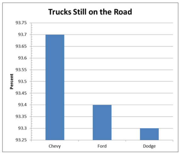
So we left off with this graph, that shows Chevy is by far the most dependable truck because the bar is so much higher than the bar for Ford or Dodge. But look more closely. What does the scale on the left of the graph show you?

This graph was created with the exact same source data. So why does it look so different? Look closely at the scale on the left side of each graph. The top graph has a scale that goes from 93.25 to 93.75, while the bottom graph shows from ZERO to 100. Does that make a difference? You bet it does. The three bars appear to be equal in height, so it looks like there is NO DIFFERENCE at all in the three truck manufacturers' quality.
The truth is that the difference between the best (Chevy at 93.7%) and the worst (Dodge at 93.3%) was really a difference of only 4 trucks out of 1000.
The truth is that the difference between the best (Chevy at 93.7%) and the worst (Dodge at 93.3%) was really a difference of only 4 trucks out of 1000.
More Bad Graphs!?
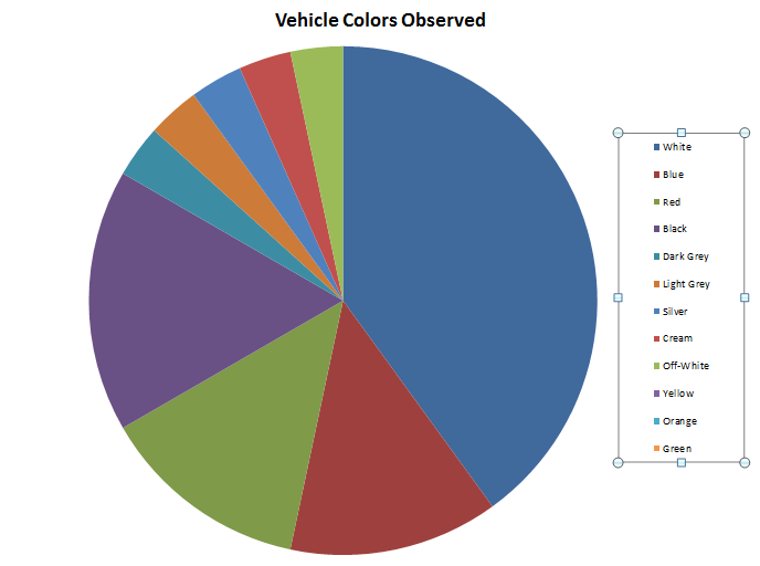
This one is so bad, I almost don't know where to start!
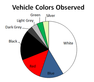
It was created using the table seen here on the right. What's wrong? For one thing there are categories that are listed in the graph but don't have a pie slice. That means, that when they were collecting data, they didn't see any cars that were Yellow, Orange or Green, but they listed them in the graph anyway. That's Terrible! |
|
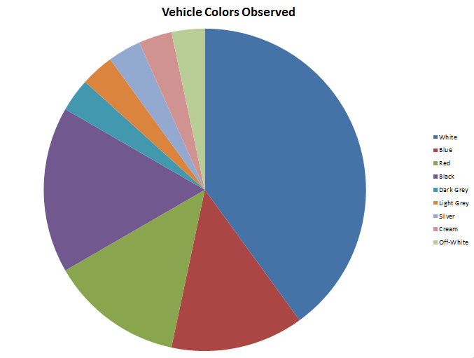
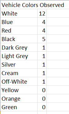
This one is better because the Yellow, Orange and Green were removed. This makes sense, right? because no cars were observed that were those colors.
It is still a bad graph. Do you see why? |
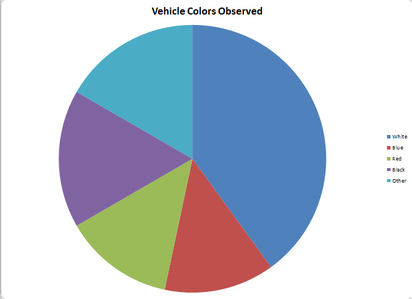
This graph seems better, because the really tiny categories were removed. We did that by grouping them together into a category called "OTHER."
That makes the graph seem less confusing, but that causes another problem. The category "OTHER" should only be used for very small amounts, but in this example, when combined into OTHER those tiny amounts are as large as some of the other slices, and that makes the OTHER piece seem important. |
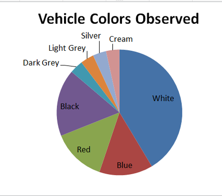
This is also vastly improved because now you have the labels connected to the right pie slice. There is no guessing which label lines up with which slice.
But something about this graph still doesn't make a lot of sense. Can we fix it? Of course we can! |
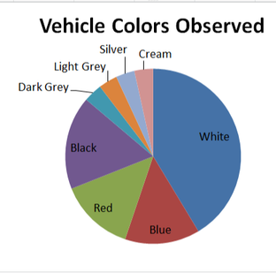
This graph is also much more intuitive, as the colors of the slices more accurately match the colors of the cars observed. Again, if you look at the graph on the right, the blue slice is the largest, and people viewing your graph may be misled into thinking that Blue was the most commonly observed color of car. Matching the pie slice color to the label names removes that confusion.
|
|
HOME PAGE * TOP OF THIS PAGE * PROJECTS PAGE
